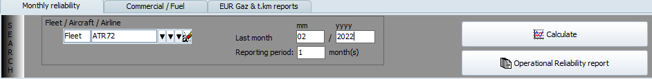
To produce an operational reliability report, select the aircraft, or fleet, or customer you want to report as well as the reporting month and period (defaults to 1 month but can be increased as desired), then:
- Click on the "Calculate" button to display all charts on screen
- Click on the "Operational reliability report" button to produce the report (pdf) (and also display the charts on screen)
The Operational reliability report contain the following sections (which can be selected /deselected by the user when producing the report):
Fleet List:
This section contain the list of aircraft being reported
This list of aircraft matches the aircraft selected by the user, either by selection of a designated aircraft, a fleet of aircraft, all aircraft operated by a designated customer.
For each aircraft, this section contains:
- The aircraft registration, aircraft type, MSN;
- Hours Bloc: The bloc time recorded on this aircraft for the selected period;
- FH Flight Hours recorded on this aircraft during for the selected period;
- Cycles: The number of flight cycles on this aircraft during for the selected period;
- Total Hours Bloc since the aircraft was manufactured
- Total FH since the aircraft was manufactured
- Total Cycles since the aircraft was manufactured
Activity:
Figure:
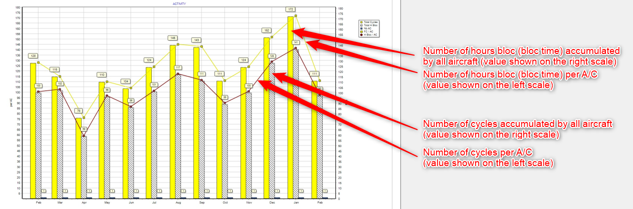
Table:
For each of the 13 last months, the table contain the following data:
Nb A/C: Number of aircraft in the selection
FH: Flight Hours
H Bloc: Hours Bloc
FC: Flight Cycles
FH per FC: FH per FC ratio
H Bloc per FC: Hour Bloc per FC ratio
The daily rates are also present
General Delays:
Figure 1:
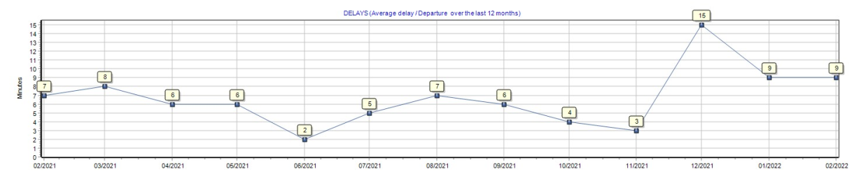
This figure show the average delay per departure. The number displayed is, on an average basis, the delay in minutes of each departure.
Figure 2:
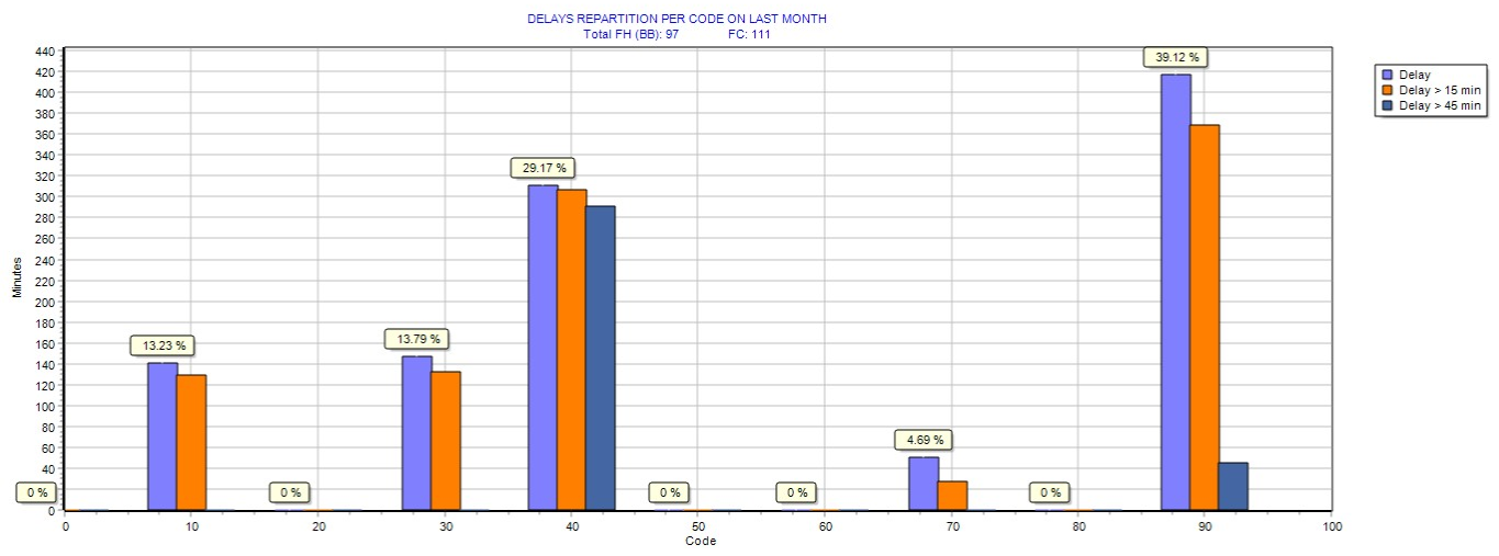
This figure shows the ratio (percent) of delays per delay codes for the last month (February in the above example).
Delay code are the IATA delay codes:
- 10...19: Passenger and Baggages
- 20...29: Cargo and Mail
- 30...39: Aircraft and ramp handling
- 40...49: Technical
- 50...59: Damage to aircraft
- 60...69: Flight Operations and Crewing
- 70...79: Weather
- 80...89: ATFM Restrictions
- 90...99: Reactionary and Miscellaneous
Figure 3:
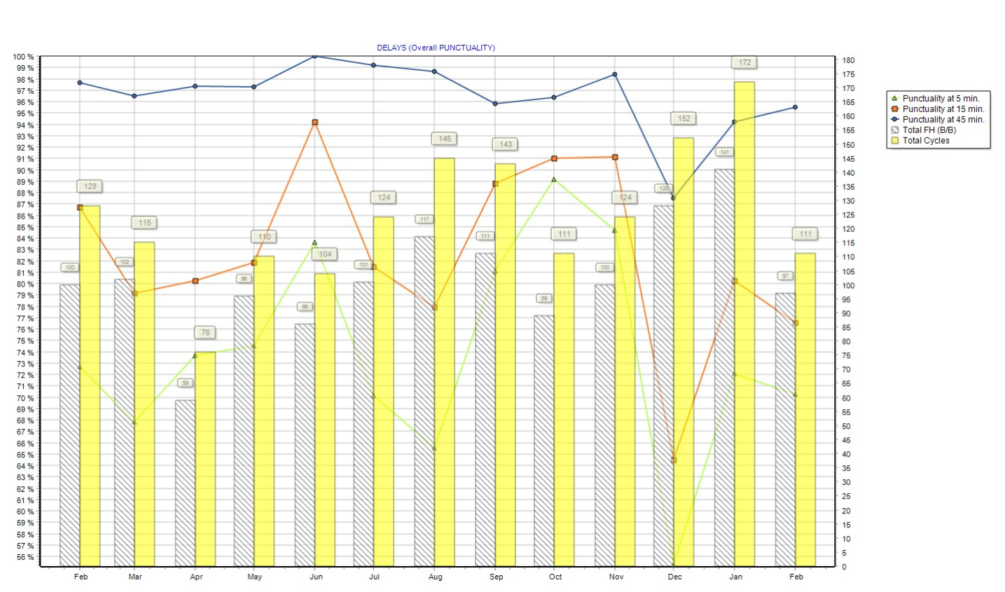
- Punctuality at 5 minutes: Number of on-time departure / Number of departure, in percent, if an on-time departure is a flight departing no more than 5 minutes after the scheduled departure time.
- Punctuality at 15 minutes: Number of on-time departure / Number of departure, in percent, if an on-time departure is a flight departing no more than 15 minutes after the scheduled departure time.
- Punctuality at 45 minutes: Number of on-time departure / Number of departure, in percent, if an on-time departure is a flight departing no more than 45 minutes after the scheduled departure time.
Punctuality at 5 minutes is always lower (or equal) than punctuality at 15 minutes, which is always lower than punctuality at 45 minutes
Punctuality at 15 minutes is often used as the internal standard when publishing airline punctuality figures
Table 1: Top 30 delays for any cause (delay exceeding 5 minutes on commercial flights)
This table shows the 30 biggest delays for the reported period (Feb in this example)
Table 2: Top 10 delays by airport (delay exceeding 5 minutes on commercial flights)
This table shows the top 10 highest sum of delay duration per airport and per delay code. The first row show the airport and delay code causing the most delay and the total delay in minutes.
Technical Delays
This section is the same as the previous section (general delays) except that it is focusing on technical delays only (delay code 40 to 49)
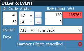
Operational events & Flight cancellations
This section shows all operational events which occurred during the reported period
The events displayed in this section of the report are the events entered in the Activity/Flight Logs:
MEL
Figure 1:
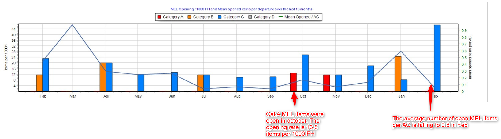
This figure shows the rate of opening per 1000 FH for category A, B, C and D MELs (plain color bar-chart), using the left scale. This graph use a rate per 1000 FH (not a straight number of items) so that the number and the trend is not sensitive to fleet modification (number of aircraft being operated) nor to high variation of aircraft utilization. For example, opening 3 Cat A MEL on 1 aircraft operated only for 20 FH this month (opening rate = 3/20 * 1000 = 150) is not the same thing as opening the same number of items (3 Cat A MEL items) on a fleet of 4 aircraft accumulating 1000 FH this month (opening rate = 3/1000 * 1000 = 3).
This figure also shows (plain line) the average number of open MEL items per aircraft, using the right scale. This number is the number of open MELs that a pilot would find when taking an aircraft, on an average basis.
Figure 2:
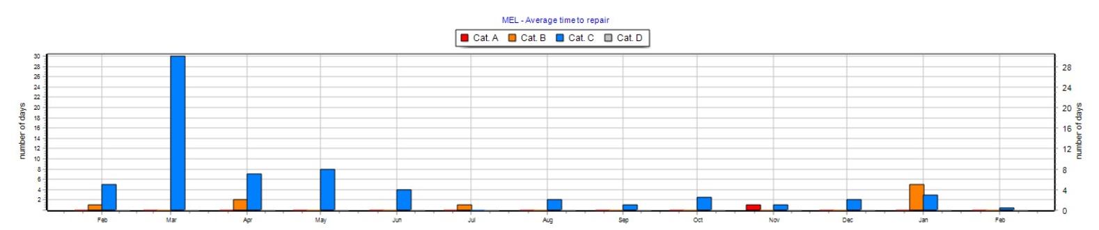
This figure shows the average time to repair each MEL item category (A / B /C /D), in days.
Table 1:
This table contains the data related to the previous figures (figure 1 and figure 2).
Figure 3:
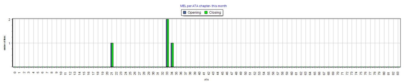
This figure shows the number of MEL items opened this month per ATA chapter
Table 2:
This table includes the details of all MEL items opened or closed during the report period (February in our example). For each MEL item, this includes the opening date, the ATA chapter, the aircraft registration, the MEL category, closure date, defect description.
HIL
Figure 1:
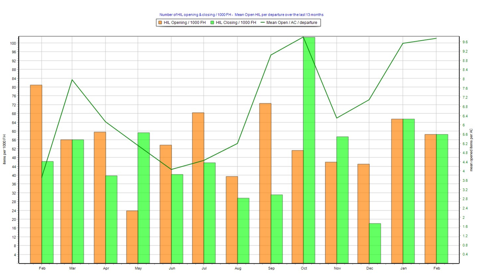
This figure shows the rate of HIL opening and closing per 1000 FH (bar-chart), using the left scale.
Note this is a rate per 1000 FH and not a number of items so that the values and trend can be interpreted without considering the aircraft utilization and the size of the fleet.
This figure also shows the average number of open HIL items per aircraft (plain line), using the right scale. This number is the number of open HIL on any aircraft departure, on an average basis.
PIREPS
Figure 1:
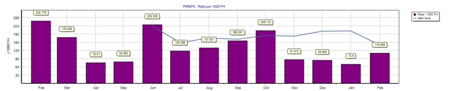
This figure shows the rate of pilot reports (PIRPES) per 1000 FH, and the calculated alert level.
The alert level is calculated using the formula displayed on the report (which is the standard deviation over the past 3 months) . This alert level can be interpreted as being the historical value.
When the rate (bar-chart) exceeds the alert level (plain line), this means the PIREPS rate is increasing at an alerting rate (refer to next figure to analyze this alert)
When the rate (bar-chart) in bellow the alert level (plain line), this means the PIREPS rate is not triggering an alert.
Figure 2:
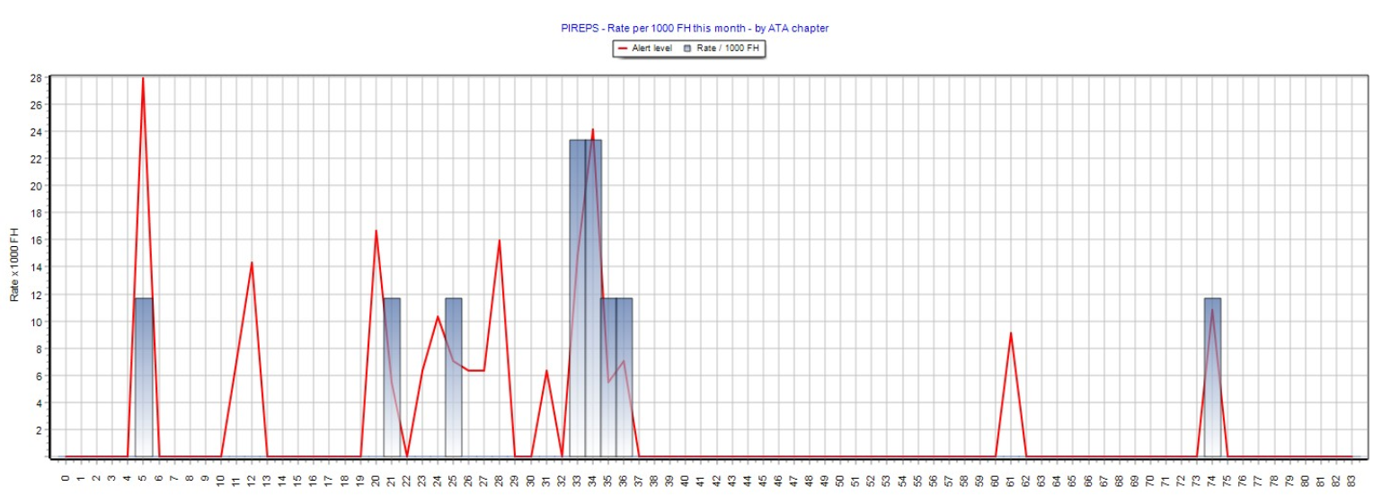
This figure shows the PIREPS rate per 1000 FH by ATA chapter, for the current period (February in our example)
The bar-chart shows the actual rate and the plain line shows the alert level
Note: The alert level is the same as in the previous figure, except that it is calculated for each ATA chapter
Each time the actual rate (bar-chart) exceeds the alter level, this denotes a negative trend alert.
Table 1/
This table contains the value represented in figure 1 and figure 2 above.
Main Maintenance Operations
Table 1:
This table lists all work-packages and major tasks (tasks displayed on the aircraft specifications) executed during the reporting period (February in our example).
Maintenance Findings
Table 1:
This table contains the defects raised during the reporting period. For each defect, it contains the WO reference, WO date, the aircraft MSN and registration, the ATA chapter, the defect description, the maintenance action accomplished to close or defer the defect, the type of defect (note 1), the corrosion type (note 2), the defect level (note 3)
Type of defect (note 1):
COR corrosion
ABR abrasion
BEN bend
BRE break
DET dent
DBD disbond
CRK crack
DEL delamination
GOG gouge
HOL hole
RIP ripple
ROC rubbing/chaffing
SCR scratch
TEA tear
WRN worn
OTH other
Corrosion type (note 2):
GEN generalized
CRE crevice
EXF exfoliation
FIL filiform
GAL galvanic
INT intergranular
PIT pitting
STR stress
OTH other
UNK unknown
Defect level (note 3):
Level 1: Minor
Level 2: Significant
Level 3: Major
Scheduled component removals
This section includes a chart showing the unscheduled component removal rates per 1000 FH, over the last 13 months.
Note: This is a rate per 1000 FH and not a number of removals so that the values and trend can be interpreted without considering the aircraft utilization and the size of the fleet.
EDTO Tech Logs
This section lists all flights where the aircraft was dispatched for extended operations (EDTO)
Note: Mark the sector as EDTO in the module Activity/Flight Logs for the flight to be represented in this section of the report. Flights from and to the same airports may not always have the same EDTO property. This is only when the aircraft was dispatched for EDTO operations that the EDTO property shall be set (ticked)